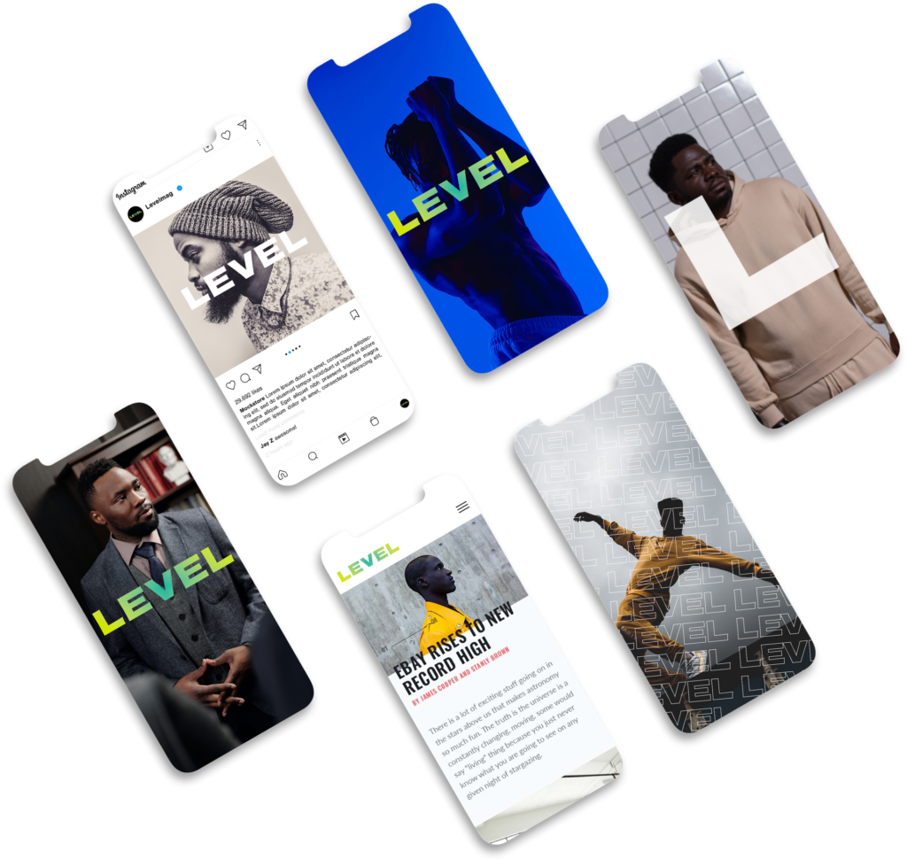
Full visual identity rebrand for the relaunch of Levelman.com as an independent platform, transitioning from its previous home on Medium.com. The rebrand was crafted to redefine Levelman’s identity as a standalone site while keeping its core values intact. This comprehensive design project included a new logo, updated color scheme, revamped typography, and a modernized website interface—all aimed at building a stronger, more cohesive visual language. The visual aesthetic is clean but layered, bright but not poppy, eclectic but not quirky. There is strength in the foundation built over the years, when users are on LEVEL they should feel secure and solid.

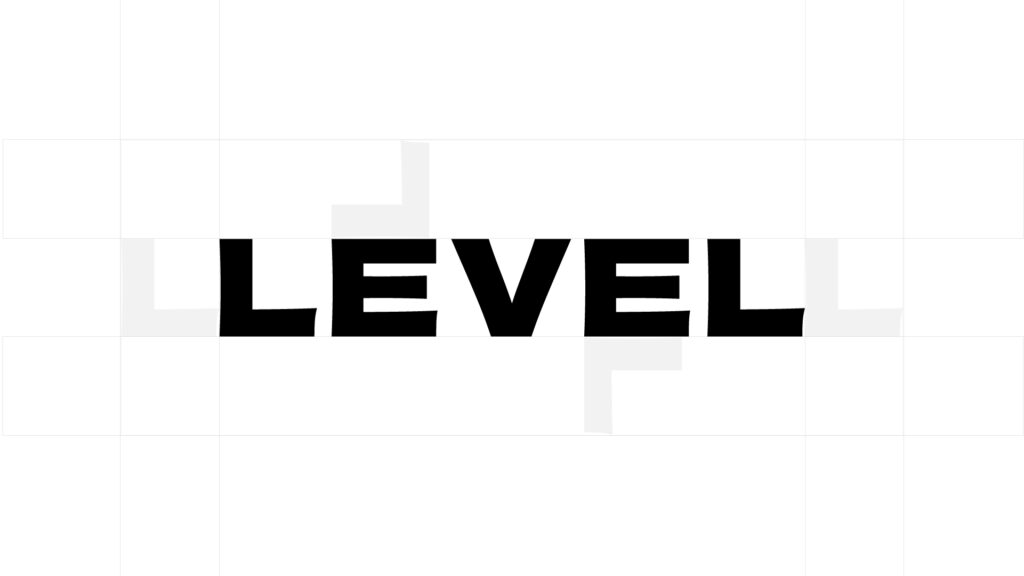
The new logo embodies Levelman’s essence of sophistication and approachability. Designed to resonate with the target audience of modern men seeking balance in life, the logo employs a bold yet clean design. The minimalist approach ensures it’s versatile across various digital platforms while maintaining a distinct identity. This redesign reflects a balance between masculinity and modern sensibilities, capturing the brand’s mission.

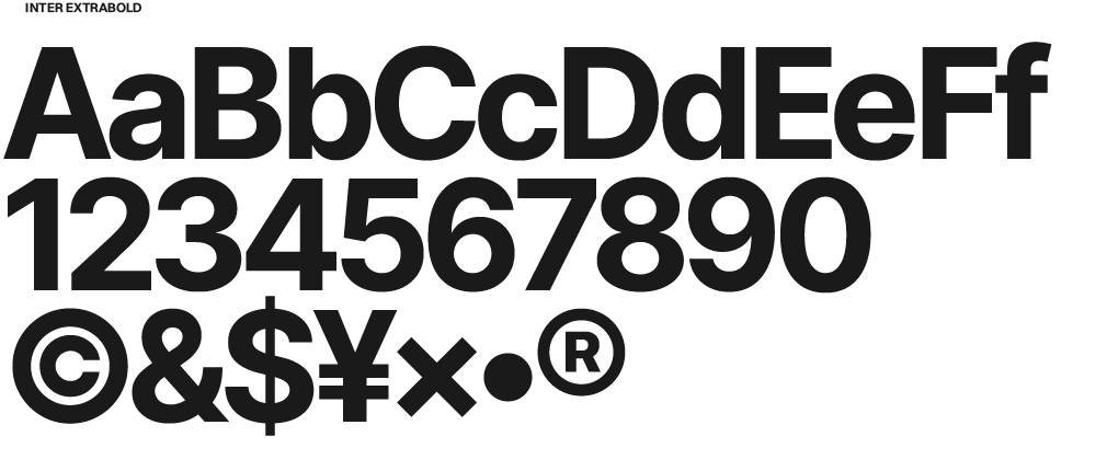
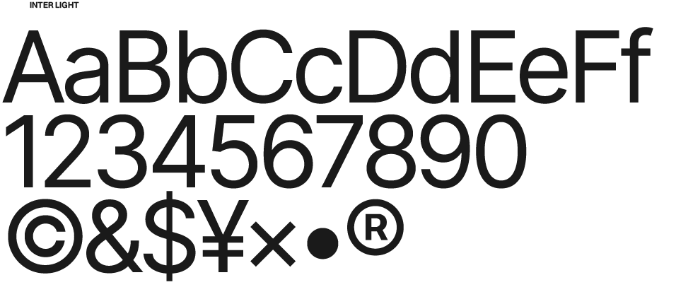
The updated color scheme balances a mature, neutral palette with vibrant accent colors that symbolize growth and creativity. Warm tones, such as deep greens and muted greys, create a professional and grounded feel. The typography was carefully chosen to maintain readability while enhancing the brand’s character, with a mix of bold headers and clean body fonts that convey both authority and approachability.


One of the primary goals of the rebrand was to create consistency across all touchpoints. From social media profiles to newsletter designs and article graphics, the new visual identity reflects Levelman’s evolution. Custom imagery and iconography were developed to align with the new tone, highlighting the brand’s focus on modern masculinity, personal growth, and lifestyle improvement.
Brandon Douglas @2024